02 Mar Style like a stager: Décor Do’s and Don’ts From Home Staging Experts
Justin M. Riordan, founder of Spade and Archer Design Agency in Portland, Seattle and Palm Springs, shares some simple home staging secrets homeowners can take a cue from.
1. Avoid buying colored furniture.
Red, sofas go out of style faster than bell bottom jeans. The same goes for any other color of the rainbow. Whereas neutral sofas like gray or white can stay in style for years to come. If you must have red in your living room, buy red throw pillows and blankets instead.
2. Choose “warm white” light bulbs (2700-3000K).
These more closely mimic incandescent lighting. “Daylight” which is 5000K mimics the color of the sun which is beautiful outside during the day, but harsh and blue inside at night. Note: Color temperature measured in degrees Kelvin has nothing to do with light output, which is measured in Lumens. Degrees Kelvin and Luman output are, in fact, mutually exclusive.
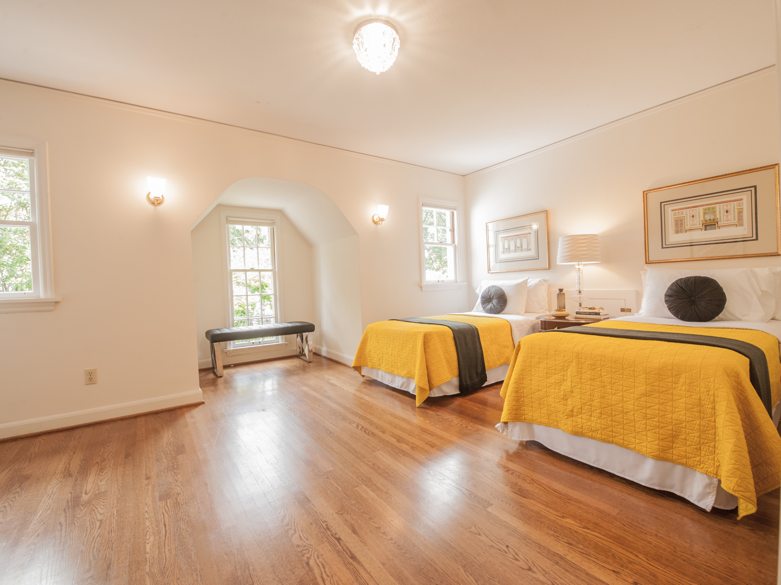
Image: Spade and Archer
3. Don’t hang your art so high!
The average human eyeball is only 5’-0” above the floor. So why do most people insist on hanging their artwork at 6’-0”. Think of it this way, you want to look straight into your artwork when you are standing, not up toward your artwork.
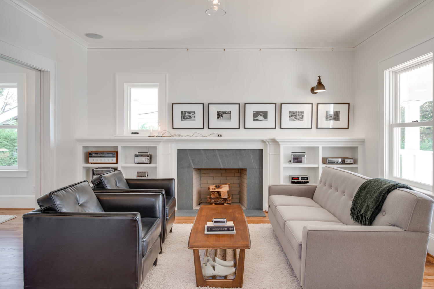
Image: Spade and Archer
4. Keep your basic linens and dishes white.
White sheets, napkins, towel, and tablecloths aways look crisp and clean with a touch of bleach and Mrs. Stewarts Bluing. If you add all white dishes to the mix, no matter what gets torn, broken or lost, it can easily be replaced, because they are all white.
Image: Spade and Archer
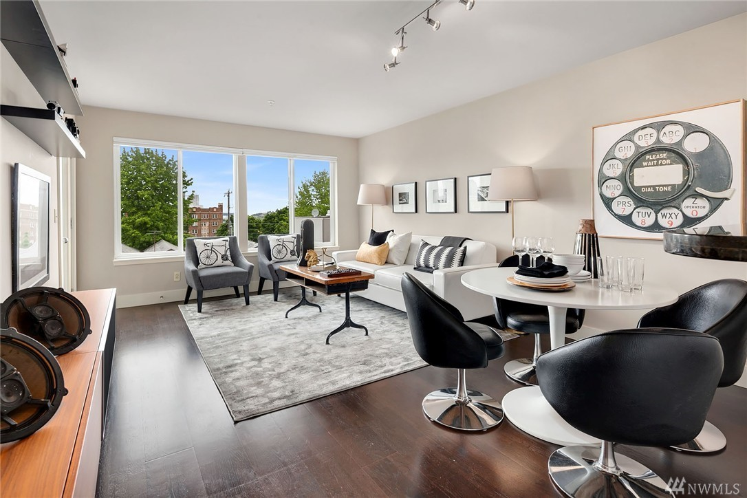
5. Limit the color scheme.
There are neutrals and there are colors. The neutrals are black, white, grey, brown, beige, cream, silver and sometimes gold. You can put as many different neutrals in a room as you want. They can form a great base for your color. The colors are the rainbow: red, orange, yellow, green, blue and purple. Colors must be used with great restraint. We endeavor to have only one “color story” per room. A color story might be blues or reds or colors of the peacock, or teal and yellow. If you have more than one color story per room, the photographs will start to look chaotic and visually noisy.
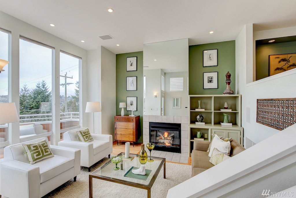
photo: NWMLS
6. Rely on symmetry, repetition, rhythm.
Symmetry, repetition, and rhythm can be found throughout nature and humans find them to be aesthetically pleasing. Symmetry can be found in most animals and insects. Repetition is why we find flowers so pleasing. Rhythm can be found in the ripples of a sand dune. A quick and easy way to make a space more aesthetically pleasing is to use these simple principles of good design.
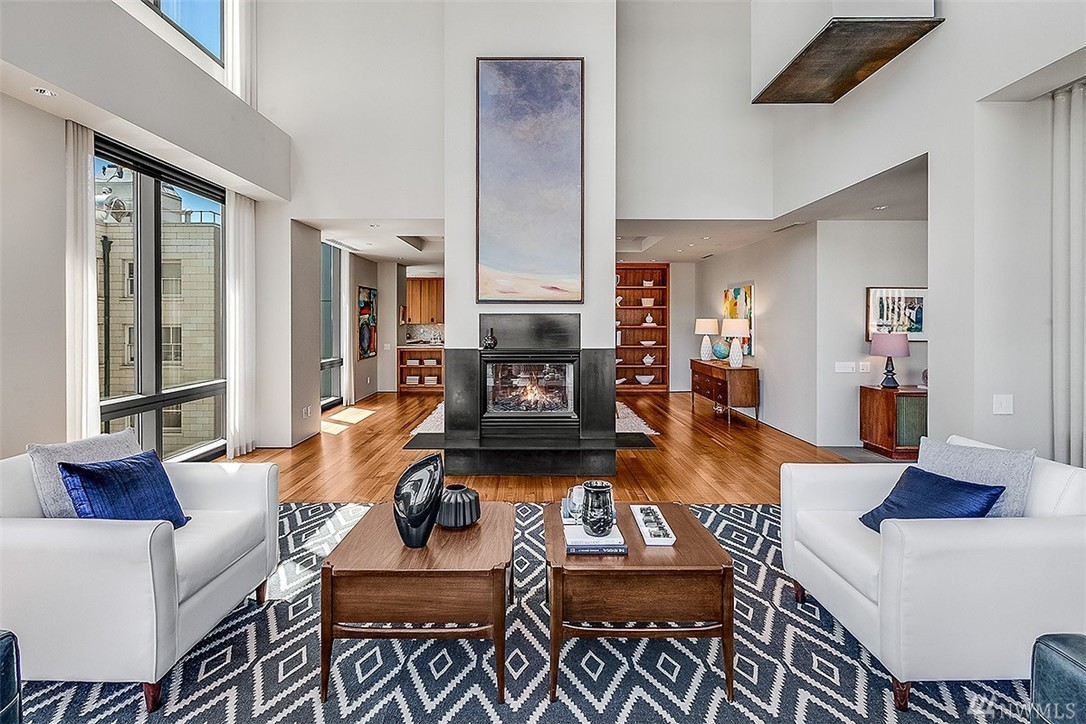
Photo:NWMLS
