23 Apr Malcom Davis Architecture Opens Up the Sky
We have our heads in the clouds with this amazing residential project by Malcolm Davis Architecture. When a cute San Francisco family found it was time to spread out from their 1,600 sq ft home, the need for additional storage and decluttering became pressing. Their desire for a cleaner, more organized space led to their search for local architects to help expand their home, implementing a seamless floorplan to accommodate their growing family. It was architect Malcolm Davis of who caught their eye as they pored over portfolios.
Davis, therefore, pulled together two plans—one was modest in scope, but still gave the couple more space, and the other was larger in scale. The client favored the bolder, more dramatic approach and went with the larger expansion; the results are fabulous.
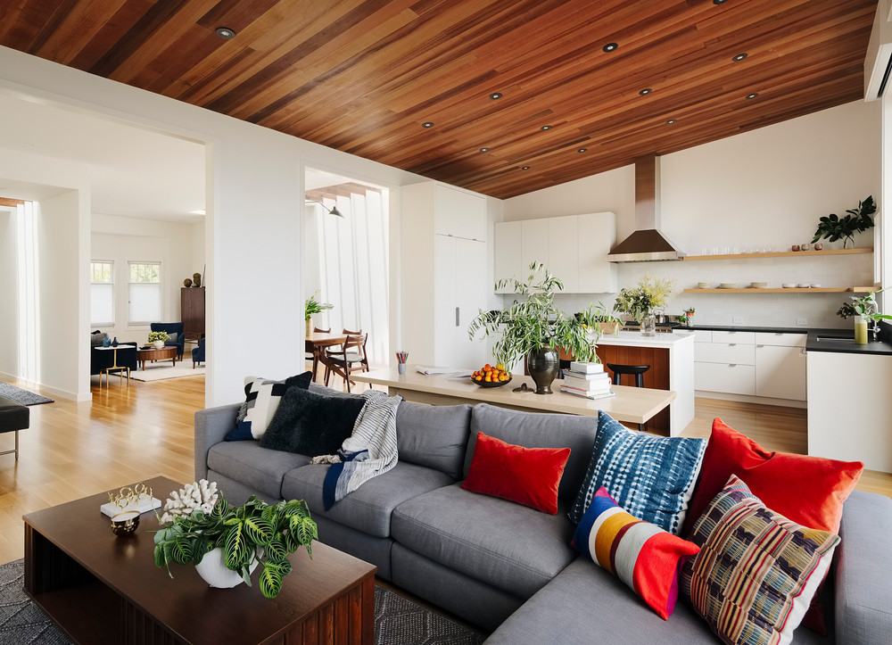
For the remodel, the home was basically stripped down to the studs. In lieu of adding square footage by adding a third story, the ceilings were heightened to allow breathing room throughout the house. Because of the home’s long lot, a master ensuite was added to the downstairs (where the other three bedrooms were), and a kitchen and dining area were added on the main floor. When all was said and done, the home grew to 3,300 square feet post-renovation.
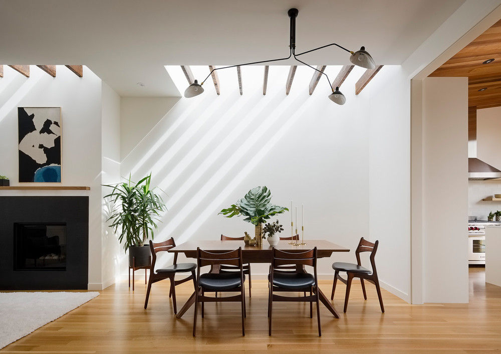
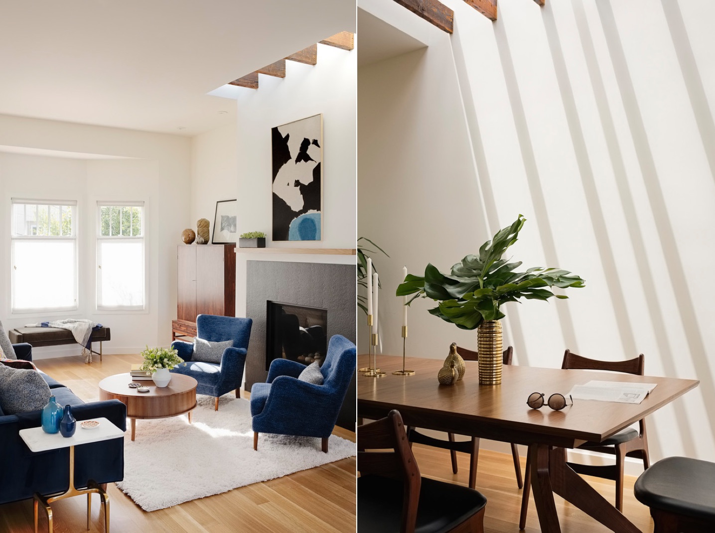
Even though Davis was able to brighten the living areas by taking advantage of sun exposure from all four sides of the home, the architect wanted to add more natural light with the addition of strategically placed skylights in the dining and family rooms.
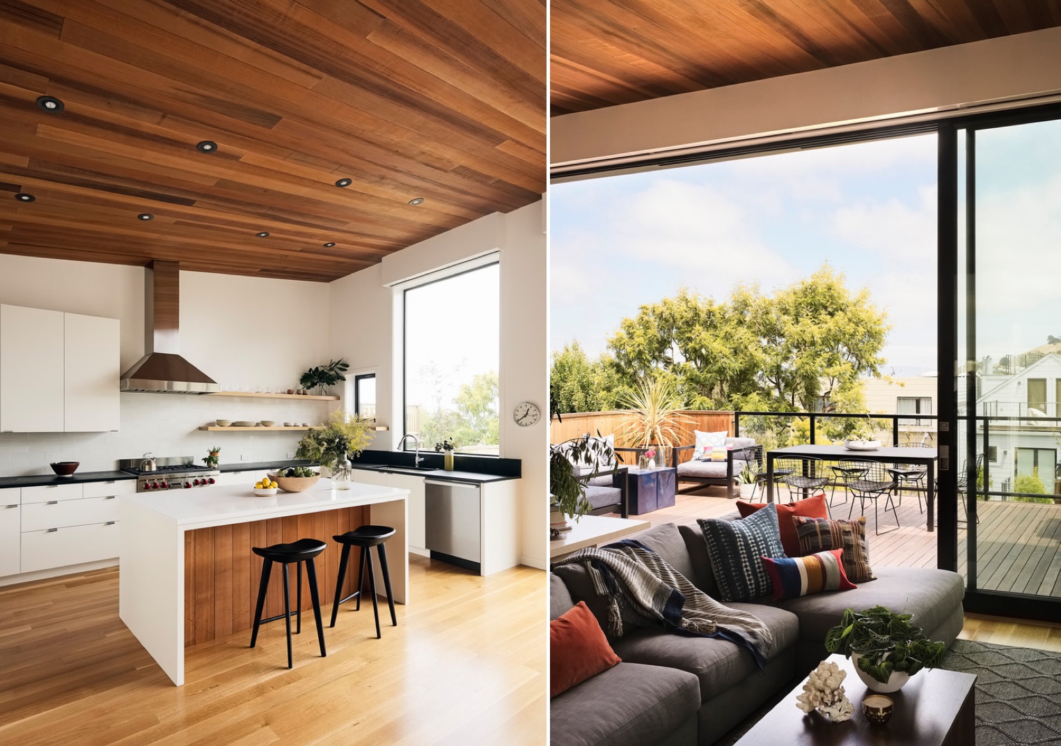
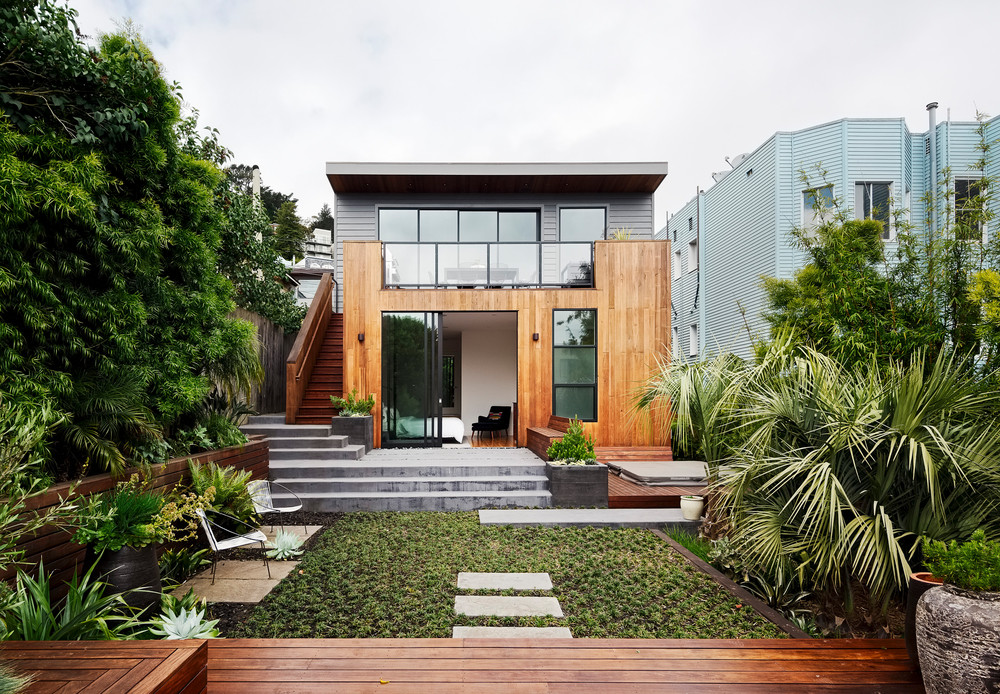
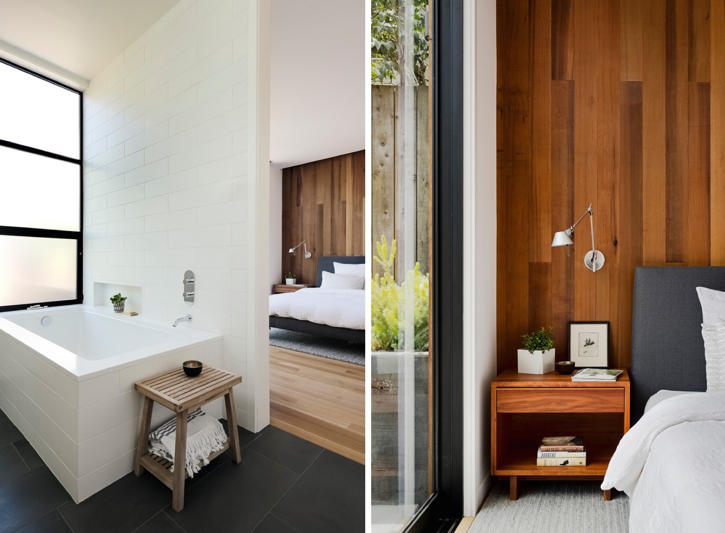
To add warmth to the space, Davis pulled more of the cedar wood into the kitchen design, where it was added to the underside of the island and ceiling of the kitchen. The same original cedar wood was also added to the master bedroom, where a full wall of golden wood serves as the headboard to the bed.
Interior designer Lori Yeomans highlighted Davis’s architectural details with a clean aesthetic, utilizing some of the couple’s existing pieces and mixing them together with newer, more modern accessories and lighting. The streamlined, open look was just what the Burroughs lacked in their previous space.
Perhaps our favorite feature in the project, the skylights create a sense of openness that adds volume to the space, while flooding each area with as much natural light as possible. The complete project is a beautiful mixture of clean, crisp walls, complemented with stunning rich wood tones, for a modern, clean look that will accommodate the growing family with simplicity and style to spare.
